VA.gov for U.S. Department of Veterans Affairs
Upgrading OZK.com’s navigation for growing content requirements
Research and redesign of OZK.com’s IA to meet growing content needs
BACKGROUND
OZK's content was growing, and it had nowhere to go.
When Bank of the Ozarks rebranded to Bank OZK, a new website was needed to reflect the brand’s new tech-forward values. One of the most important aspects of the branding was to expand the navigation from the previous, over-simplified structure. Due to time constraints, a full content schedule was not determined before development was set to begin, so a temporary navigation solution was fashioned.
As more content was created, the secondary navigation of the site expanded and available space became a problem. With the addition of new verticals to the content structure, we had to go to the drawing board to redesign our navigation.
RESEARCH
To see how our users conceptualize our content, I launched an open card sort study.
For the open card sort, 50 total users responded completed the task, and 6 were disqualified.
Results
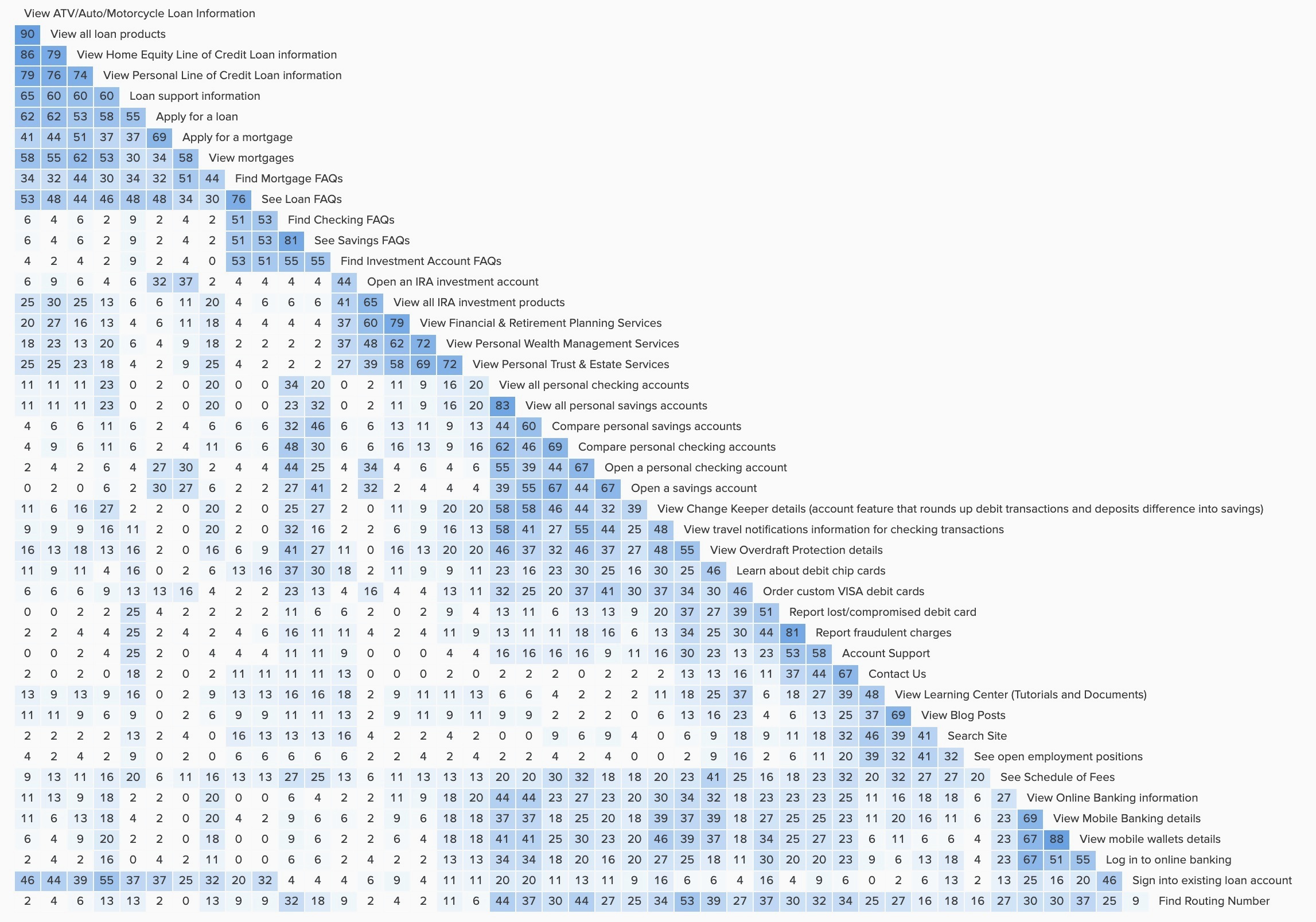
Our similarity matrix was divergent, so to help me understand our quantitative results on a more personal level, I watched the UserTesting recordings. I found that users had very different mental models for the categorization of our content.
Our users had three strategies:
- The goal-centric strategy; users categorized their cards to follow goals like assessing products, opening accounts, and getting support.
- The product-centric strategy; users categorized their cards into product groups, nesting secondary links like open account and get support underneath their respective products.
- Combined goal-centric and product-centric strategy; users were ambidextrous in their grouping logic, sometimes expressing their desire to place things in multiple categories.
With the open card sort data, I was also able to more accurately gauge logical naming conventions for our content.
TESTING
Tree testing and iterating our IA design
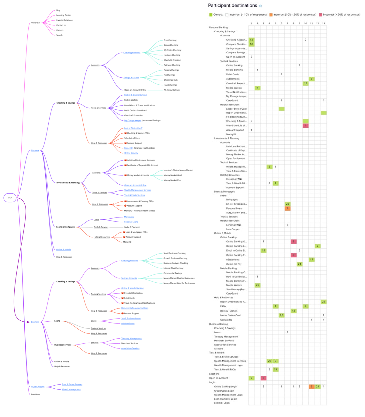
Because our users had two separate but valid strategies for organizing our content, I hypothesized that a polyhierarchical navigation structure would serve our customers best. This would allow us to nest links like “Checking Account FAQs” under both the Checking & Savings Accounts and Help & Resources sections.
First I built an nav tree, including both content we already have and planned content from our roadmap. In order to group and name our content, we used the dendrogram and category names from our card sort data.
Results
With the prototype, I achieved an 80% success rate and a 77% directness score across all of the tasks. The results were promising, with only a few points of failure that I reworked into the structure. Following some tree rework, I was able to rerun the test with 30 more users, improving our success rate by 7% and our directness score by 2%.
With a second iteration, I was able to achieve a 87% success rate and 79% directness score for the polyhierarchical navigation.
DESIGN
Desktop navigation
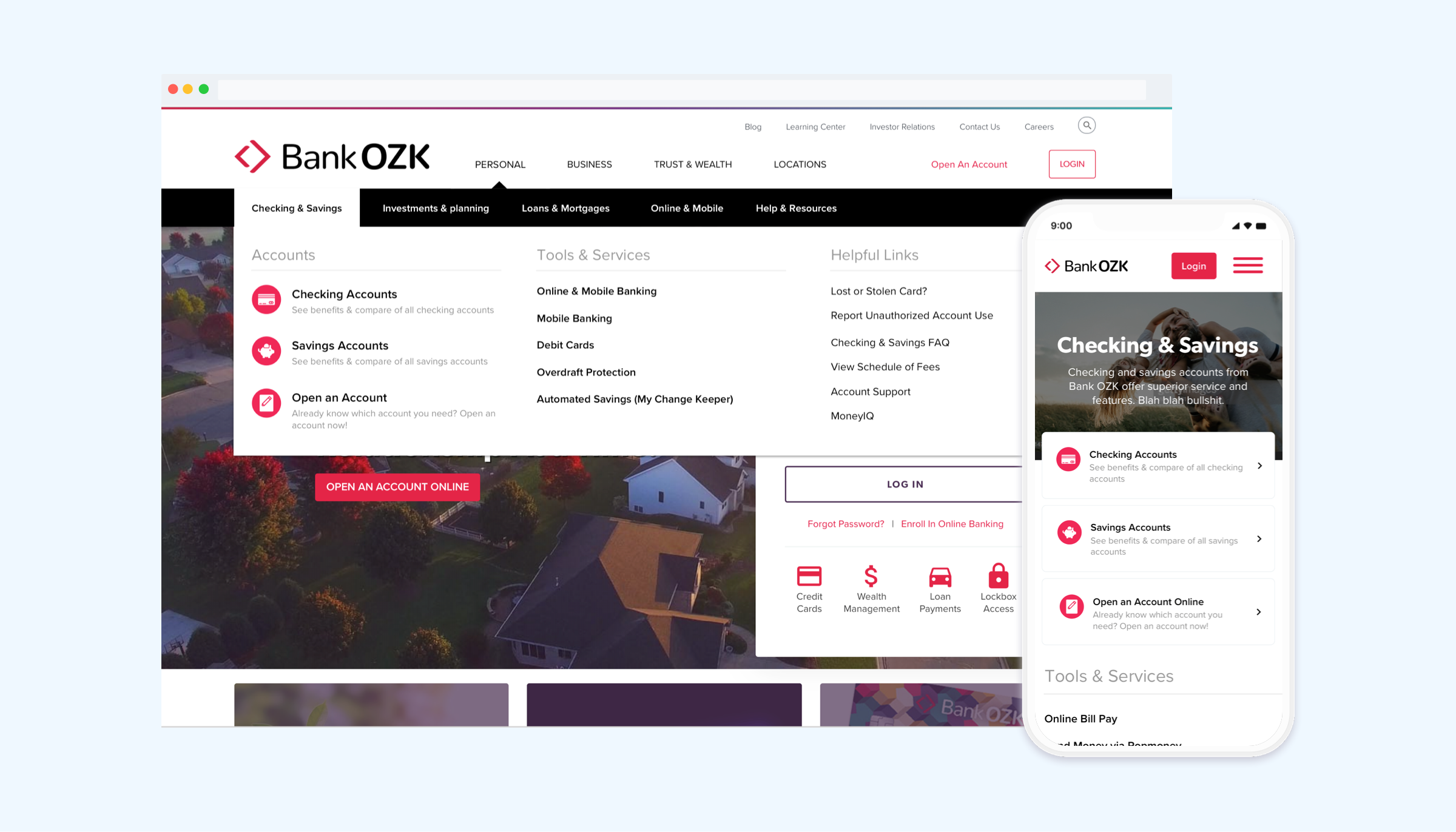
Due to the structure of the IA, we landed on a three-layer navigation:
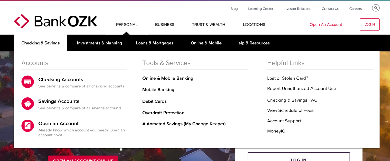
Megamenu design
From left to right, links become more specific and "less important." To emphasize the more important links, we make them much more visually salient with icons.
- First Column: Category Products (e.g. Checking Accounts, Mortgages)
- Second Column: Tools & Services (e.g. Zelle, Mortgage Calculator, Online Banking)
- Third Column: Help & Resources (e.g. Checking FAQs, Report Fraud, Documents)
Mobile navigation
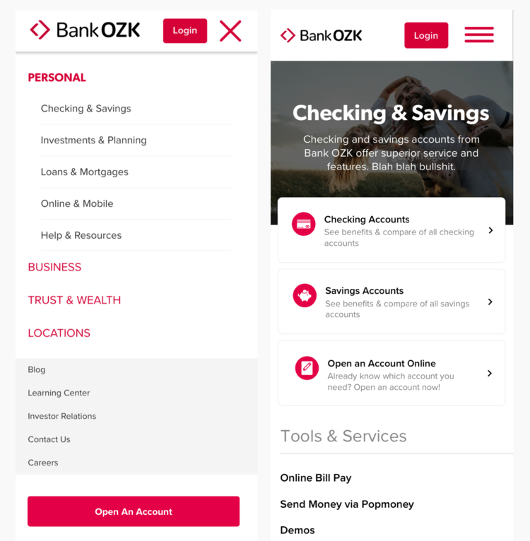
In order to reduce the amount of complexity in the mobile hamburger menu, I created a page representation of the mega menu (right).
This design allowed me to keep the mobile menu on a single level, without its own internal navigation. It also prevented additional development hours being spent on the mobile navigation being rewritten.
