OZK.com for Bank OZK
Improving the account shopping experience on OZK.com
Research and design for a new account comparison tool for better online account opening conversion rates
BACKGROUND
Online account opening was failing to capture customers like intended.
Months after the initial release of online account opening, we were not meeting our business goals for the project. Traffic was being driven to the application, but we had very low numbers for accounts being opened. Analytics revealed a 88% bounce rate upon arriving to the first page of online account opening — a page with only a single ZIP input.
After finding no critical issues with the application to explain the bounce rate, we turned our attention to the context of the application and the higher level decision making that goes into choosing a banking relationship.
USER RESEARCH OUTCOMES
We needed to support product exploration and decision-making on our website before account opening.
In a remote, moderated study, we asked 14 participants to evaluate products and apply for an account with the Bank OZK. As we watched our participants try and fail to shop for accounts, the reason for mass abandonment of online account opening became clear: our customers were seeking information about our products and not finding it.
Key findings:
→ Site navigation led users into account opening before evaluating products
→ The existing product table made account information difficult to compare
→ There was no natural bridge between choosing an account and opening one
→ There was not enough information to make a decision on the product selection page of the online application
→ Limited accounts available to open online turned users off to opening an account
COMPETITIVE ANALYSIS & PREFERENCE TESTING
We tested our competitors' tools to see what would work well for our customers.
Observing our competitors, we found that they all had variations of the same core features: product category overviews, guided account selection, product comparison, and product details.
To see how people approach shopping for accounts, we launched three preference studies between 6 of our competitors: Regions, TD, Citi, Key, SunTrust, and BBVA Compass.
Product category overviews
- Users were often distracted by summarized product cards and felt unprepared to make a decision.
- “Fluffy” marketing content got in the way of decision-making. When choosing accounts, users want facts and stats, not feelings.

Guided account selection
- Users overwhelmingly opt for product comparison over guided selection, when available.
- Users often have strong preferences before arriving on the site; when using guided selection, users look for a few high level requirements such as no- or low-fees, no minimum balance, and/or free checks.
- Users don’t trust the suggestions; users go through guided selection, get an answer, then return to account comparison to check their other options anyway.

Product comparison
- Users want to see all of their options at once; when presented with partial comparison tables, users feared they were missing something important and would put extra effort into seeing every option.
- Users appreciate deliberate data formatting; concise language, tiger striped rows, and subheadings made longer content more scannable, reducing task time.

Product details
- Users arrived on the details page ready to finalize their decision by investigating the nitty gritty. Users reacted most favorably to simple tables.
- Users appreciated the “most important” high impact aspects of the account being listed prominently with more minor information less prioritized.

USER RESEARCH
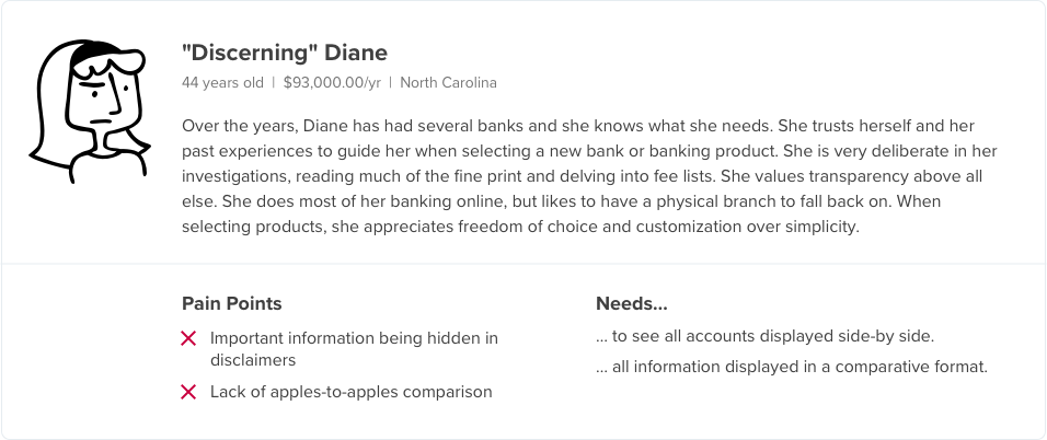
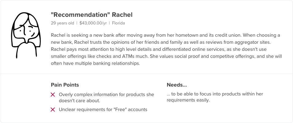
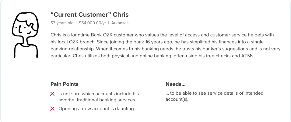
Sharing our findings with personas
After 15 one-on-one interviews and watching 48 participants evaluate our competitors’ sites, I was able to define a few key personas to share with my team and stakeholders.
COMPETITIVE ANALYSIS & PREFERENCE TESTING OUTCOMES
After testing our competitors' sites, we felt confident in our design hypotheses for our prototype.
Based on our research findings, we would:
→ Prioritize side-by-side comparison of products immediately.
→ Emphasize the differences between products while minimizing the similarities for lighter information density.
→ Enable users to compare all options, but allow them to reduce in order to minimize cognitive load.
DESIGN
Ideation
Collaborative whiteboarding
I carved out some time on my teams' calendars for a 4-hour design jam session where everyone had access to digital or analog whiteboards. We broke into groups and created concepts all afternoon, continuously refining our concepts until we all agreed on our vision.
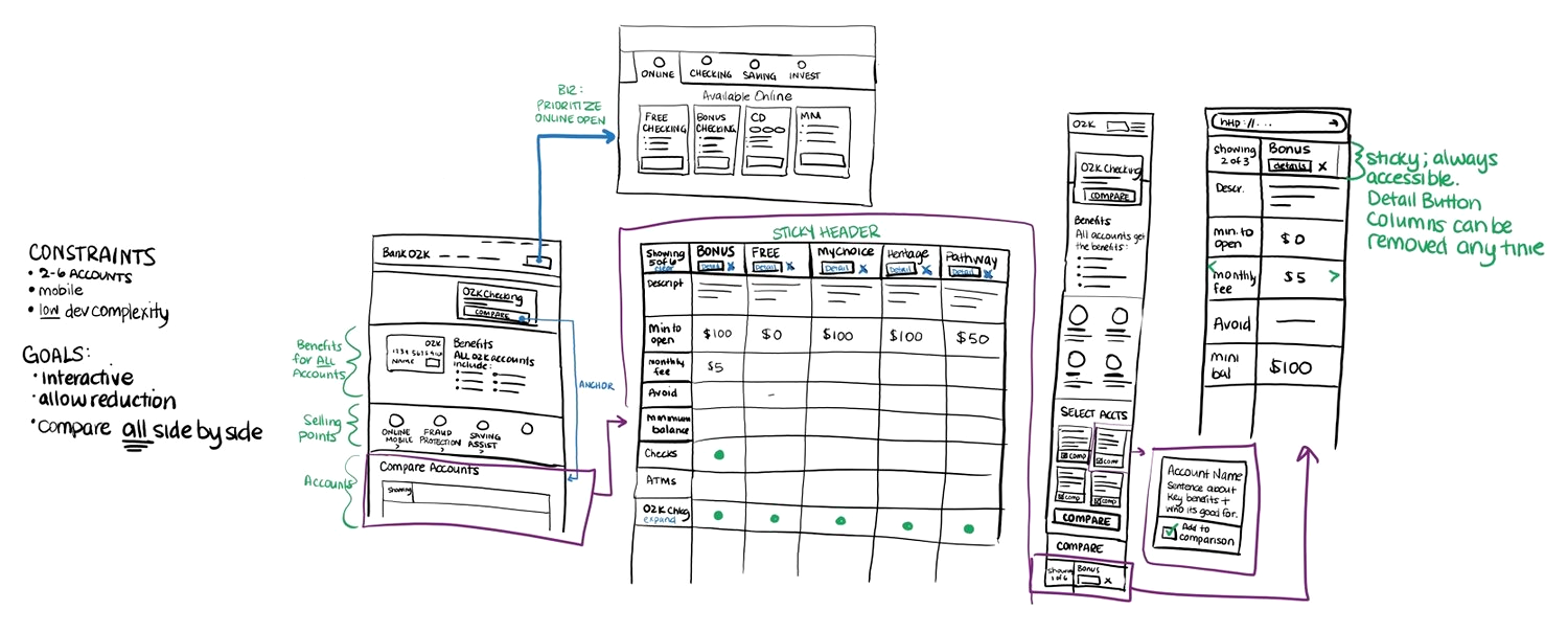
The final digital sketch from our design jam session
Refined wireflows
Once our design jam was over, I quickly created thumbnail wireflows to make sure the user flows were being properly represented in the concept.
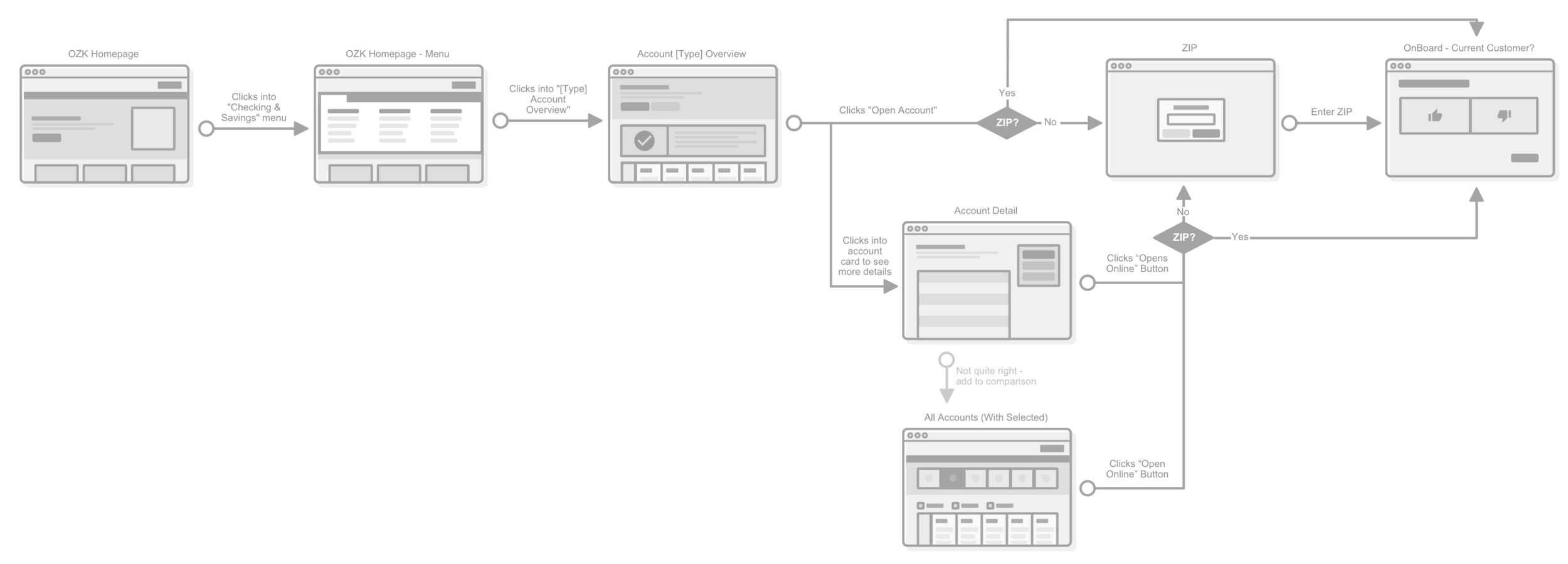
User Flow—Opening an Account:

User Flow—Evaluating Accounts:
Desktop wireframe
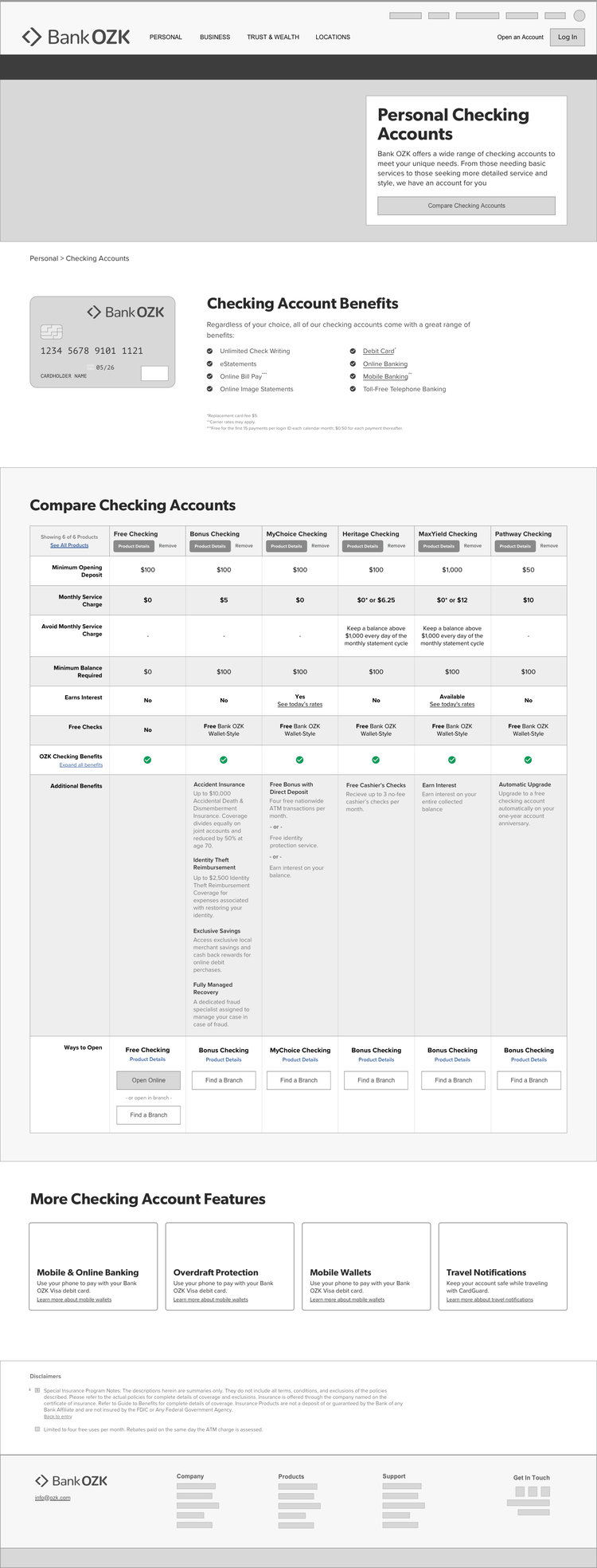
Personal Checking Accounts Hero
The page begins with an intro to accounts at OZK and an anchor link button that sends users to the comparison table.
Checking Account Benefits Section:
All checking accounts from OZK include a standard set of benefits, which are listed in a bulleted list.
Compare Checking Accounts Section:
The comparison table allows users to compare directly across benefits, with the most impactful benefits prioritized to the top. Common features are hidden by default, but expandable. Users are able to browse and narrow down all of their choices easily by removing columns. If needed, users can restore columns by reseting the filters.
Ways to open provides a clear indication of which products are available to open online, minimizing the negative impact of a reduced online product offering.
More Checking Account Features
Additional premium feature links are provided below.
Mobile design
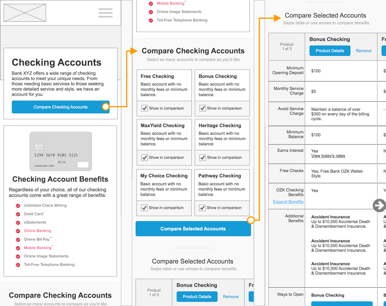
Small product cards include short, high-level descriptions of key product benefits and are placed above the table itself. Users can use the checkboxes to add or remove the products from the table below.
Horizontal scrolling allows for direct cross comparison across the rows.
See a rudimentary prototype (password is ‘protected’).
Final designs
LESSONS LEARNED
Reflecting on my work
In the end, this design wasn't prioritized to go to development. To my knowledge, this problem still exists today on OZK.com. This was one of my first end-to-almost-end projects at the bank, and it was my first experience with something just not quite "getting there."
As I look back on this work a few years on, I find myself picking apart the design. While I'm satisfied with my research and the ideas it generated, I see flaws in my design execution of those ideas. My understanding of web technologies, engineering effort, and scalability was much more limited than it is now, but I chose to give this work — and past me — grace for that.
If faced with this design challenge today, I would focus on making a lightweight mobile experience and do much more to ensure accessibility of my solution.
